
Corrected chart:
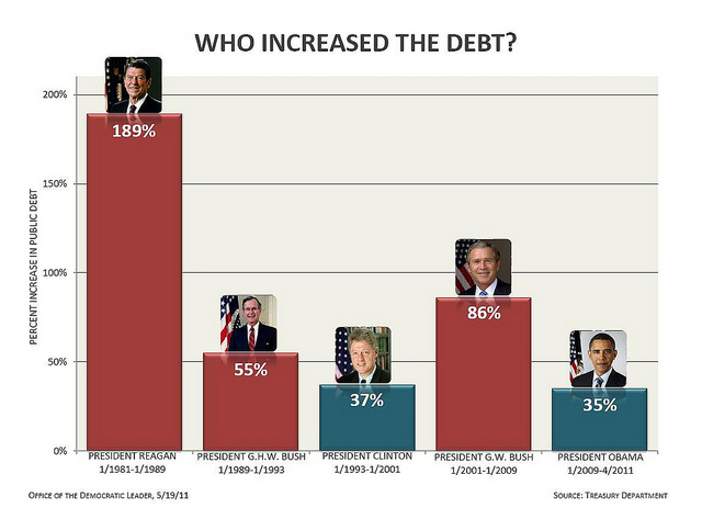
And the rest of the issues from Politifact:
• Time ranges: Bush served a full eight-year term, while Obama had served just 27 months by the time the chart was compiled. If the Obama figure were to be scaled out to a full eight-year period, he’d have a debt increase of 121 percent rather than 34 percent, making his increase greater than Bush’s. To be fair, that would be a simplistic exercise -- but no less misleading than the chart.
• Public debt vs. gross debt: Not only did the chart say it was using one statistic and then use another, it also cherry-picked the one that showed the comparison in a more favorable light. According to OMB statistics, public debt rose by 70 percent under Bush, 16 percentage points more slowly than gross federal debt did. And according to the Treasury, the public debt rose by 53 percent under Obama, compared with the 34 percent rise in gross federal debt.
Those numbers would have shown the two presidents much closer in their debt creation records -- and that’s without even adjusting for the vastly different lengths of time in office.
• Debt vs. debt as a percentage of GDP: Some economists will tell you that it’s not the size of the debt per se, but rather the size of the debt relative to the nation’s gross domestic product. This helps minimize the complicating effect of economic cycles and inflation. So how do those numbers stack up? Using OMB statistics, here’s what we came up with, using public debt figures not adjusted for the president’s time in office:
Reagan: Up 14.9 percentage points
George H.W. Bush: Up 7.1 percentage points
Clinton: Down 13.4 percentage points
George W. Bush: Up 5.6 percentage points
Obama: Up 21.9 percentage points (through December 2010 only)